Another video upload, this time I am colouring the digi stamp 'Flapper Twirl'.

Showing posts with label Art techniques. Show all posts
Showing posts with label Art techniques. Show all posts
Monday, March 20, 2017
Thursday, March 16, 2017
COPIC COLOURING TUTORIAL - SWING GIRL
Just updated my channel with a new speed colouring video using Copics! I am colouring a simpler image called 'Swing Girl'. Do check it out!
Thursday, June 9, 2016
VIDEO: INKING MY LINEART & NEW DIGI!
Just made a new video while inking my sketch, this one will be titled 'Idyllic Garden'! It is the next digi stamp coming up. You can click directly to Youtube to view it in high resolution and subscribe to my channel if you wish!
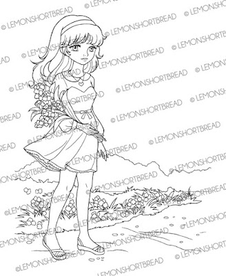
New digi 'Idyllic Stroll' listed in my shop! You can get it here:
https://www.etsy.com/listing/385161508/
Idyllic Garden is now available!
https://www.etsy.com/listing/386125944/

New digi 'Idyllic Stroll' listed in my shop! You can get it here:
https://www.etsy.com/listing/385161508/

Idyllic Garden is now available!
https://www.etsy.com/listing/386125944/

Friday, March 18, 2016
MONAMI BAUHAUS COLOURED PENCILS DEMO & REVIEW
Made a short video demo / review on Monami's Bauhaus 36-clr Coloured Pencils. Hope you find it useful. Monami is a Korean stationery company and these pencils come in a pretty tin box. They are wax-based. If you are in Singapore, they can be purchased from Popular bookstore. I personally only use them for simple colouring as the leads are too waxy for me.
Wednesday, February 3, 2016
VIDEO TUTORIAL: HOW TO COLOUR WITH COPIC MARKERS ON ISLANDER DIGI

Part 1: Face, Dress, Accessories
Part 2: Hair, finishing & background
Hope you find the video useful. I am not a pro with markers and tend to avoid high contrast shadows, also I don't have that many colours lol. You can view it on youtube if the resolution here is too small. Sorry about the lighting and exposure. It was getting dark.

The lineart is available here:https://www.etsy.com/sg-en/listing/265479600/
Friday, January 1, 2016
COLLEEN COLOURED PENCILS REVIEW
Wishing everyone a Happy New Year! What did you do on New Year's Eve? Well
I made a short video demo with Colleen coloured pencils if you ever wondered about how they perform. Yup while the fireworks were going off in the horizon lol.
Colleen pencils are considered student's grade within the low price range, and are mostly used by childen in Asia. Since colouring books are quite popular now, adults and even artists worldwide are starting to discover them. They used to be made in Japan but are currently based in Thailand, of which the quality feels the same. You can get them on Amazon or Ebay.
They are much waxier, smoother and softer than my other pencils like say... the Luna Staedlers which I had as a child. I don't know exactly how good they are for professional work, because colour pencils are not my forte and I have never tried out professional grade pencils. I DO know I have a soft spot for them as they had the cutest, prettiest packaging back in the 70s-80s and all the cool kids had them in school because they were pricey back then, even the ones in default orange cartoon cardboard packaging. My absolute faves are the ones with shoujo illustrations on tin.
 https://www.etsy.com/sg-en/listing/215603558/vintage-1984-little-twin-stars-sanrio
by Lemonshortbread on Etsy
Takahashi Macoto's shoujo girls were featured on many of the boxes. Can you tell why I am biased much?!
 https://www.etsy.com/sg-en/listing/247546167/vintage-colleen-japanese-makoto-1980s
by PreppyPastel on Etsy
One of my fave shops on Etsy!
 https://www.etsy.com/ca/listing/240463119/vintage-cute-japan-rare-macoto-t-art
by GGdolls on Etsy.
This was the one I've used before in kindergarten or sunday school, unfortunately it wasn't mine but school property. All I did was stare at the packaging, I am not kidding.
 This is a very cool site if you love vintage shoujo!
http://www.harapekodoggybag.com/vintage-macoto-takahashi-makoto-lady-12-color-pencils-colleen-stationery-retro-girl-big-eyes-1970.html
Think I've strayed off topic, anyhow I will post another more in-depth text review. Hope you enjoyed the video anyhow, 'like' and subscribe on youtube if you wish!
Colleen pencils are considered student's grade within the low price range, and are mostly used by childen in Asia. Since colouring books are quite popular now, adults and even artists worldwide are starting to discover them. They used to be made in Japan but are currently based in Thailand, of which the quality feels the same. You can get them on Amazon or Ebay.
They are much waxier, smoother and softer than my other pencils like say... the Luna Staedlers which I had as a child. I don't know exactly how good they are for professional work, because colour pencils are not my forte and I have never tried out professional grade pencils. I DO know I have a soft spot for them as they had the cutest, prettiest packaging back in the 70s-80s and all the cool kids had them in school because they were pricey back then, even the ones in default orange cartoon cardboard packaging. My absolute faves are the ones with shoujo illustrations on tin.

by Lemonshortbread on Etsy
Takahashi Macoto's shoujo girls were featured on many of the boxes. Can you tell why I am biased much?!

by PreppyPastel on Etsy
One of my fave shops on Etsy!

by GGdolls on Etsy.
This was the one I've used before in kindergarten or sunday school, unfortunately it wasn't mine but school property. All I did was stare at the packaging, I am not kidding.

http://www.harapekodoggybag.com/vintage-macoto-takahashi-makoto-lady-12-color-pencils-colleen-stationery-retro-girl-big-eyes-1970.html
Think I've strayed off topic, anyhow I will post another more in-depth text review. Hope you enjoyed the video anyhow, 'like' and subscribe on youtube if you wish!
Tuesday, May 12, 2015
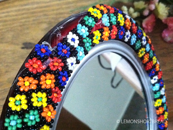
DECORATING A MIRROR WITH VINTAGE

I purchased this plastic mirror last minute for a jewellery booth many years back, and since I disliked how tacky it looked, it was immediately put away after that event so I didn't have to look at it lol.
Anyhow I re-found it and decided to 'deco-den' it just because. This is not my original idea by the way. When I was an intern (around 1999) at a local bags & accessories company, the boss requested me to decorate two table mirrors as frou frou-ish as I could, with cabochon and ric rac samples and scrap pink feathers because we had just revamped the stores with a fixed colour scheme. Haha, good times. Best thing was customers asked if they were for sale... unfortunately no. The mirrors did manage to get customers to stop by the shop so that was good.


Tuesday, March 24, 2015
COLOURING WITH MARKERS ON INKJET DIGI STAMPS

Since most inkjet ink is water-based, I also worry about it smudging. I am currently using an Epson inkjet printer (XP-402) with its Epson Home Claria inks (model 177) - thankfully I did not have any problems! In fact I sprayed fixative at first to seal the lines but that seemed to make blending difficult. In this blogpost, I did two tries - one with fixative and one without.
First let's look at the one sprayed with fixative. You may get different results depending on the inks and markers you are using. I am using ordinary cartridge/ cardstock paper in A4 - it is called Drawing Block paper here in Singapore, the inexpensive common kinds they use at school.


https://www.etsy.com/listing/227203390/
Next is the no-fixative-on-printout experiment, pretty straightforward so I'll just show the finished result since it was night by the time I finished colouring. Reprinted the image on a new sheet of cartridge paper and waited for it to dry. Coloured with markers directly on top and the lines stayed put! The Epson 177 model ink cartridges are not too expensive and in the lower priced range. Quite happy with my printer by the way - it's got wifi. This time I didn't use Pearl White for the skin.


Wednesday, June 15, 2011
RIBBON - PAINTING

My latest completed art, entitled 'Ribbon', acrylic on canvas. I've been wanting to do monochromes for such a long time and finally here's one. Hope you like it! The background were originally 1960s style sunburst motifs but due to clutter they were transformed into polka dots. I think it looks much better this way. Available for sale at:

Closeup of the painting after being varnished.
Friday, January 14, 2011
ACRYLIC PAINTING STEPS - NO ORDINARY DUNCE
Hi everyone just finished a painting and thought to show my processes. Still experimenting with the medium so if you have any tips please feel free to leave a comment.


I spray workable fixative on the canvas to prevent it from smudging. I use Krylon workable fixative.


After that ...sorry I left the painting sitting for 3 weeks and forgot I was doing a photolog and continued painting without taking photographs. Anyhow filled in the other colours and did gradients, blending was done by mixing 3-4 shades of colours from dark to light and blending as quickly as possible. The hats were done twice over because the first time the gradients weren't successful.


I use the Daler-Rowney Artists' Picture Varnish to seal the painting. It took forever to dry with 3 coats of varnish since it was raining everyday, got impatient with the 1st and 2nd so it is not perfect (not going to state what mishaps I had lol) and the last coat I waited about 2 weeks for it to dry properly.

'No Ordinary Dunce' is available in my Etsy shop here: No Ordinary Dunce - Original Pop Painting
Completed on 31 Dec 2010, though the varnish only dried 2 days back. Added a sawtooth hanger on the back.
I hope you enjoyed this!
Subscribe to:
Posts (Atom)